I just published another post on Data on the Rocks, a superblog with writers from around the world sharing their knowledge about the most popular BI platforms.
Sorting stacked bars from highest to lowest (Data on the Rocks)
This post demonstrates how you can re-sort each stack of bars to make it easier to visualize how dimensional values change in rank over time, while the default behavior in Qlik is to apply the same sort to the dimension in each stack, throughout the chart.
This is one of those cases where a calculated dimension is required for the chart to work dynamically, responding to filters. I don't love calculated dimensions, but it is not too complicated and does all the heavy lifting to make the rest of the chart quite simple to build.
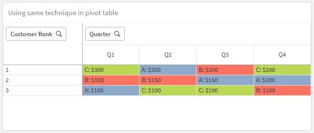
You can use a similar approach to create this bump chart-y pivot table, as well.
Details and a sample solution with data can be found in the linked post.

